官网的例子太强大了:http://www.sencha.com/products/extjs/examples/
常用界面都有例子,方便学习使用啊
这一节主要学习布局
学习地址:http://docs.sencha.com/extjs/4.2.0/extjs-build/examples/layout-browser/layout-browser.html
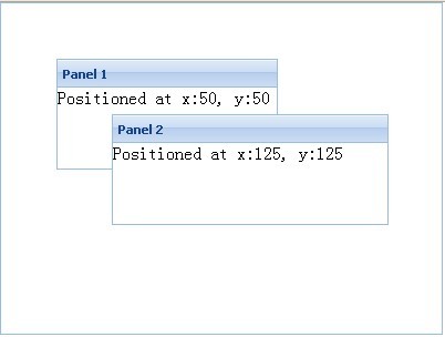
一、absolute
绝对定位
	Ext.onReady(function() {//页面初始化代码
		var panel = new Ext.Panel({
			text : "展示",
			renderTo : document.body,
			width : 400,
			height : 300,
			layout : 'absolute',
			items : [ {
				title : 'Panel 1',
				width : 200,
				height : 100,
				x : 50,
				y : 50,
				html : 'Positioned at x:50, y:50'
			}, {
				title : 'Panel 2',
				width : 250,
				height : 100,
				x : 100,
				y : 100,
				html : 'Positioned at x:125, y:125'
			} ]
		});
	})
注:
layout : 'absolute',指明布局方式
x : 50,y : 50,指明离X方向,y方向的绝对距离
二、accordion
折叠式面板,默认打开第一个(我首先想到了一些购物网站左侧菜单栏是不是可以用这个实现呢?留待以后尝试)

	var panel = new Ext.Panel({
			layout: 'accordion',
			renderTo : document.body,
			width : 200,
			height : 200,
			items:[{
			    title: 'Panel 1',
			    html: 'Content'
			},{
			    title: 'Panel 2',
			    id: 'panel2',
			    html: 'Content2'
			}]
		});
三、anchor
绝对定位

	var panel = new Ext.Panel({
			renderTo : document.body,
			width : 300,
			height :400,
			layout: 'anchor',
			items: [{
			    title: 'Panel 1',
			    height: 100,
			    anchor: '50%',
			    html: 'Panel 1 50%'
			},{
			    title: 'Panel 2',
			    height: 100,
			    anchor: '-100',
			    html: 'Panel 2 -100'
			},{
			    title: 'Panel 3',
			    anchor: '-10, -262',
			    html: 'Panel 3 -10, -262'
			}]
		});
四、border
边框式
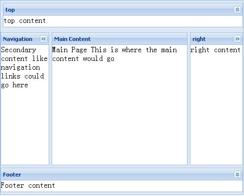
var panel = new Ext.Panel({
			renderTo : document.body,
			width : 500,
			height :400,
			layout: 'border',
			bodyBorder: false,
			defaults: {
			    collapsible: true,
			    split: true,
			    bodyPadding: 15
			},
			items: [{
			    title: 'top',
			    region: 'north',
			    height: 50,
			    minHeight: 25,
			    maxHeight: 50,
			    margins: '5 0 0 5',//上   右  下   左
			    html:"top content"
			},{
			    title: 'Footer',
			    region: 'south',
			    height: 50,
			    minHeight:25,
			    maxHeight:50,
			    margins: '0 0 5 0',//上   右  下   左
			    html:"Footer content"
			},{
			    title: 'Navigation',
			    region:'west',
			    floatable: false,
			    margins: '5 0 0 0',
			     100,
			    minWidth: 50,
			    maxWidth: 100,
			    html: "Secondary content like navigation links could go here"
			},{
			    title: 'Main Content',
			    collapsible: false,
			    region: 'center',
			    margins: '5 0 0 0',
			    html: "Main Page This is where the main content would go"
			},{
			    title: 'right',
			    region: 'east',
			     100,
			    margins: '5 0 0 0',
			    html:"right content"
			}]
		});
五、TabPanel

	var panel = new Ext.TabPanel({
			renderTo : document.body,
			width : 200,
			height :200,
			bodyBorder: true,
			activeTab: 0, // index or id
			items:[{
			    title: 'Tab 1',
			    html: 'This is tab 1 content.'
			},{
			    title: 'Tab 2',
			    html: 'This is tab 2 content.'
			},{
			    title: 'Tab 3',
			    html: 'This is tab 3 content.'
			}]
		});
六、Card (Wizard)
自定义向导风格

var panel = new Ext.Panel({
			renderTo : document.body,
			width : 300,
			height :300,
			bodyBorder: true,
			bodyStyle: 'padding:15px',
			layout:'card',
			activeItem: 0, // index or id
			bbar: ['->', {
			    id: 'card-prev',
			    text: '« Previous',
			    handler: function(btn) {
	            },
	            disabled: true
			},{
			    id: 'card-next',
			    text: 'Next »',
			    handler: function(btn) {
		        }
			}],
			items: [{
			    id: 'card-0',
			    html: 'Step 1'
			},{
			    id: 'card-1',
			    html: 'Step 2'
			},{
			    id: 'card-2',
			    html: 'Step 3'
			}]
		});
注:事件还未学习,按钮点击未实现,待解决
七、column
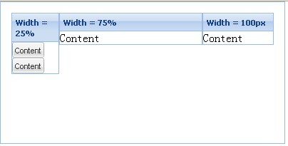
var panel = new Ext.Panel({
			renderTo : document.body,
			width : 400,
			height : 200,
			bodyBorder : true,
			bodyStyle : 'padding:15px',
			layout : 'column',
			items : [ {
				title : 'Width = 25%',
				columnWidth : .25,
				items : [ {
					xtype : "button",
					text : "Content"
				}, {
					xtype : "button",
					text : "Content"
				} ]
			}, {
				title : 'Width = 75%',
				columnWidth : .75,
				html : 'Content'
			}, {
				title : 'Width = 100px',
				width : 100,
				html : 'Content'
			} ]
		});
八、Fit
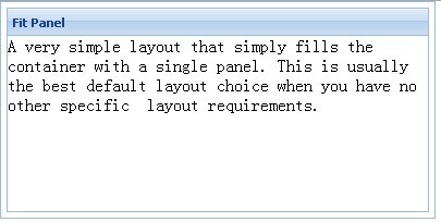
var panel = new Ext.Panel(
	 {
		 renderTo : document.body,
		 width : 400,
		 height : 200,
		 bodyBorder : true,
		 bodyStyle : 'padding:5px',
		 layout : 'fit',
		 items : [ {
			 title : 'Fit Panel',
			 html : 'A very simple layout that simply\b fills the container with a single panel.\b This is usually the best default layout\b choice when you have no other specific \b layout requirements.',
			 border : true
		 } ]
 });
九、table
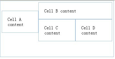
var panel = new Ext.Panel({
			renderTo : document.body,
			width : 400,
			height : 200,
			bodyBorder : true,
			bodyStyle : 'padding:5px',
			layout : {
				type : 'table',
				// The total column count must be specified here
				columns : 3
			},
			defaults : {
				// applied to each contained panel
				bodyStyle : 'padding:20px'
			},
			items : [ {
				html : 'Cell A content',
				rowspan : 2
			}, {
				html : 'Cell B content',
				colspan : 2
			}, {
				html : 'Cell C content',
				cellCls : 'highlight'
			}, {
				html : 'Cell D content'
			} ]

		});
十、vbox

	var panel = new Ext.Panel({
			renderTo : document.body,
			width : 400,
			height : 200,
			bodyBorder : true,
			bodyStyle : 'padding:5px',
			 title: "VBoxLayout Panel",
			    layout: {
			        type: 'vbox',
			        align: 'center'
			    },
			    items: [{
			        xtype: 'panel',
			        title: 'Inner Panel One',
			         250,
			        flex: 2//每个子项相对的 flex值都会与全体子项 flex累加的值相比较,根据此结果,处理每个子项的 flex 最后是多少。若不设置,表示不对子项作自适应尺寸的处理
			    },{
			        xtype: 'panel',
			        title: 'Inner Panel Two',
			         250,
			        flex: 4
			    },{
			        xtype: 'panel',
			        title: 'Inner Panel Three',
			         '50%',
			        flex: 4
			    }]
		});
十一、hbox

	var panel = new Ext.Panel({
			renderTo : document.body,
			width : 400,
			height : 200,
			bodyBorder : true,
			bodyStyle : 'padding:5px',
			 title: "HBoxLayout Panel",
			    layout: {
			        type: 'hbox',
			        align: 'stretch'
			    },
			    renderTo: document.body,
			    items: [{
			        xtype: 'panel',
			        title: 'Inner Panel One',
			        flex: 2
			    },{
			        xtype: 'panel',
			        title: 'Inner Panel Two',
			        flex: 1
			    },{
			        xtype: 'panel',
			        title: 'Inner Panel Three',
			        flex: 1
			    }]
		});